Variance Deviations on September 11 |
|
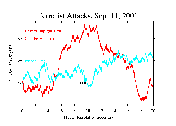
The most striking departures of the GCP data from expectation on September 11 were in the variance measure, that is, the second-by-second internode variation. Beginning at about 4 or 5 in the morning, New York time, the variance showed a persistent, slight increase, that continued until about 11:00. It then became slightly smaller than expectation and again, maintained the tendency for several hours, until about 18:00. The following figures show the cumulative deviation of the variance from its mean value for one day, the 11th, and then the same measure in a larger context of three days and 12 days. The first figure represents the formal, scientific view. Here we see very steep and long-lasting trends in the actual data, and nothing similar in the pseudo-random control data. This is the formal result, and the extreme excursion is unlikely with odds less than 1 in 1000.
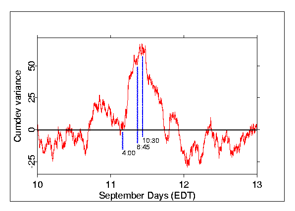
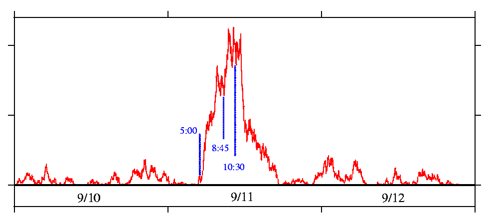
The second and third figures, although they show the actual data, emphasize an aesthetic perspective, and give a thought provoking, broader context. Just as a picture, in a purely aesthetic interpretation, the next graph, shows Sept 11 in the context of three days. It looks like a long, emphatic moment of feeling and knowing by a global consciousness. This piercing graphic cry seems symbolic of the pain surrounding our slow and spasmodic struggle to become human. It is possible to envision a global consciousness that we may one day embrace, and that could embrace us all.
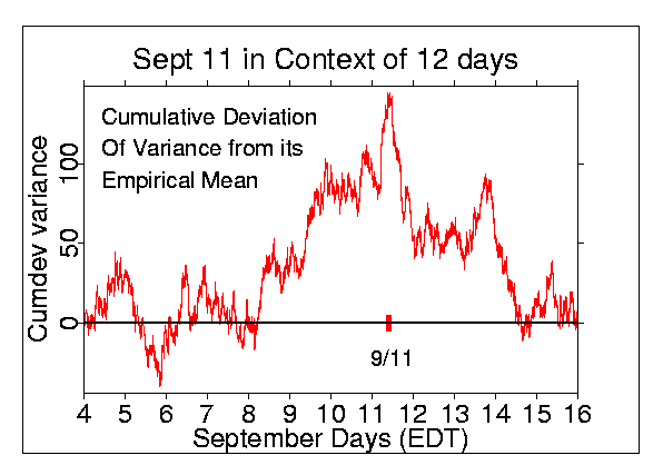
We can also look at a larger context. The impressionistic sense is that
the September 11 spike stands on a general rise suggesting, in
a creative interpretation, a larger scale of perception
and a longer premonition. If the general picture of the
graph is liberally taken, it seems to show that there
was a period of several days leading to and following the 11th during
which the EGG data showed unusual behavior. Of course, this graph also
shows that the spike on the 11th is unique mainly by its place
in the flow of time.
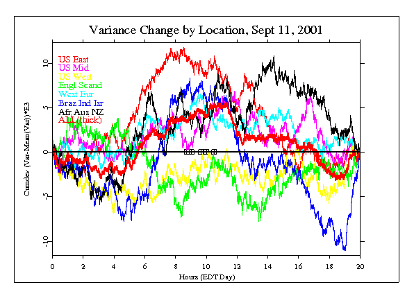
Finally, if we separate the data into groups by location, we
can see that contributions to the general shape of the
variance curve come from several, but not all areas of the
world. The differences shown here are merely suggestive, not
significant, but it is notable that the eggs on the east
coast of the US have the largest contribution. On the other
hand, eggs in the middle and west part of the US contribute
less than those far away, for example in Brazil, Africa,
India, New Zealand and Australia.
|